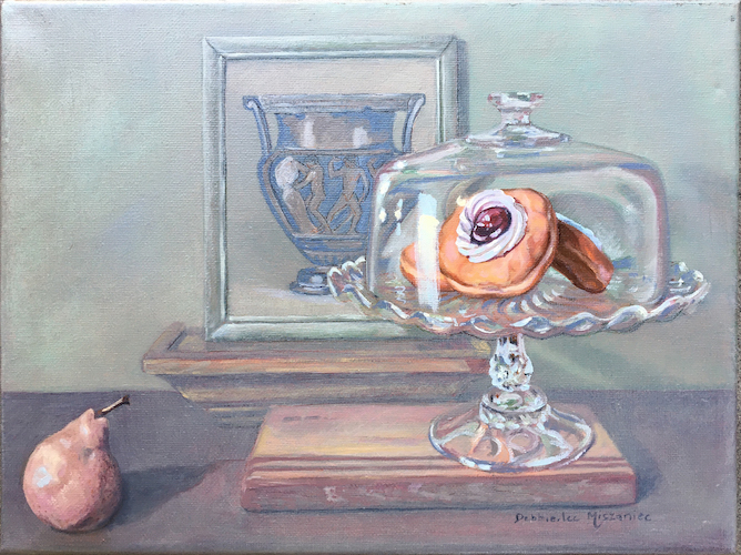
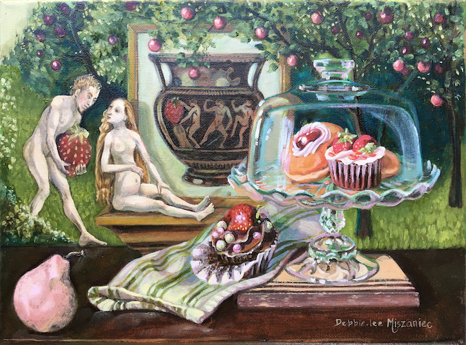
I recently finished I Only See You, a new oil painting in my Cravings series of still life paintings exploring food obsession. I Only See You focuses on the exclusionary relationship between Pink Pear and Jelly Doughnut as Sisyphus’ warnings of the doomed nature of the task fade into the background.
My inspiration for keeping the composition relatively spare in this painting came, as per Tempting Fruit, from the background colour of Terre Vert and white that I initially laid down. I loved the way colour gave an empty pining feel to the composition, so I chose to emphasize that.
I loved working with this soft complementary colour scheme so much, I think I will be using that again at some point soon in this series, possibly in the upcoming Cupcake/Fragonard paintings.
My paintings will be there, framed and ready for you to purchase. Take a look at the gallery below to select your favourite, then head down to the Western Oasis on the grounds to pick yours up before it’s gone. Access to the art show is included in park admission.
Western Showcase Mini Masters Salon Calgary Exhibition & Stampede 2022
July 8 – 17th 2022 Calgary Exhibition & Stampede – Western Oasis – Art Show 1410 Olympic Way SE Calgary AB T2G2W1
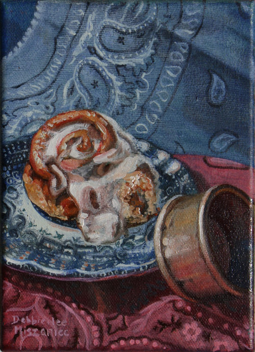
Butter Tart, Cinnamon Roll, Cupcake, Lemon Bar, Maple Cookie, and Strawberry Shortcake Each 5” x 7” oil on canvas is CAN$ 250 framed.
Well the 2022 Calgary Stampede Western Showcase is a little over a week away and I have six oil paintings going into the show! So the task now is to make sure my art is show ready.
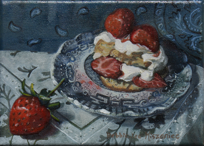
Strawberry Shortcake
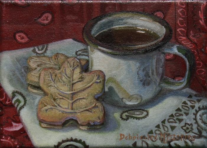
Maple Cookie
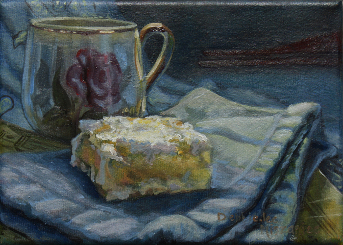
Lemon Bar
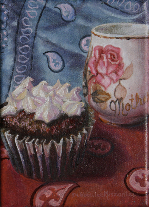
Cupcake
Cinnamon Roll
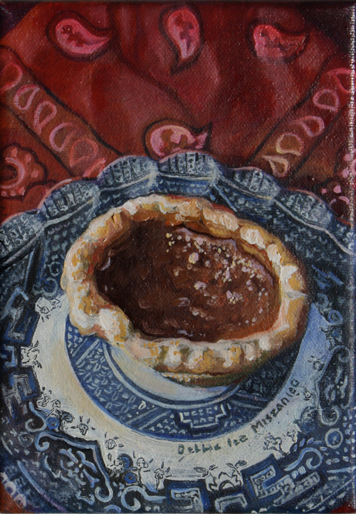
Butter Tart
Paintings in the show! Each are 5″x7″ o/c $250 framed.
So what goes in to getting art “show ready”?
Painting finished, varnished, framed & ready to hang, with 3 points of identification on the back!
Well, in case you have a show coming up and are looking for tips, I’ll share my tips with you today.
Finish the Art! Make sure your paintings are finished and dry enough to handle being out of the studio and in the real world (Duh, you say, but this can sometimes be a challenge in itself for the grand visionary perfectionists which most artists are when it comes to their art).
Varnish: I like to give mine a spray coat of the appropriate picture varnish for protection and freshness once the paint has fully cured.
Framing: Technically this is optional depending on the type of show and the type of painting, however as a former picture framer I would opt for simple framing over no framing if at all possible. First, framing is protective. It is meant to buffer the art from the scuffles it might encounter in transit, storage or display. What would you rather get damaged, the corner of the painting or the corner of the frame? Second, I have seen complimentary framing showcase good works as something truly special and play up the best qualities of mediocre work. Framing can make a big difference in the perception of the quality of art on the wall.
Hanging Hardware: Regardless of whether you choose to frame or not, you need a way to attach the art securely, yet removably, to the wall. The industry standard is D-rings and picture wire, so make sure your paintings are wired properly before they leave the studio.
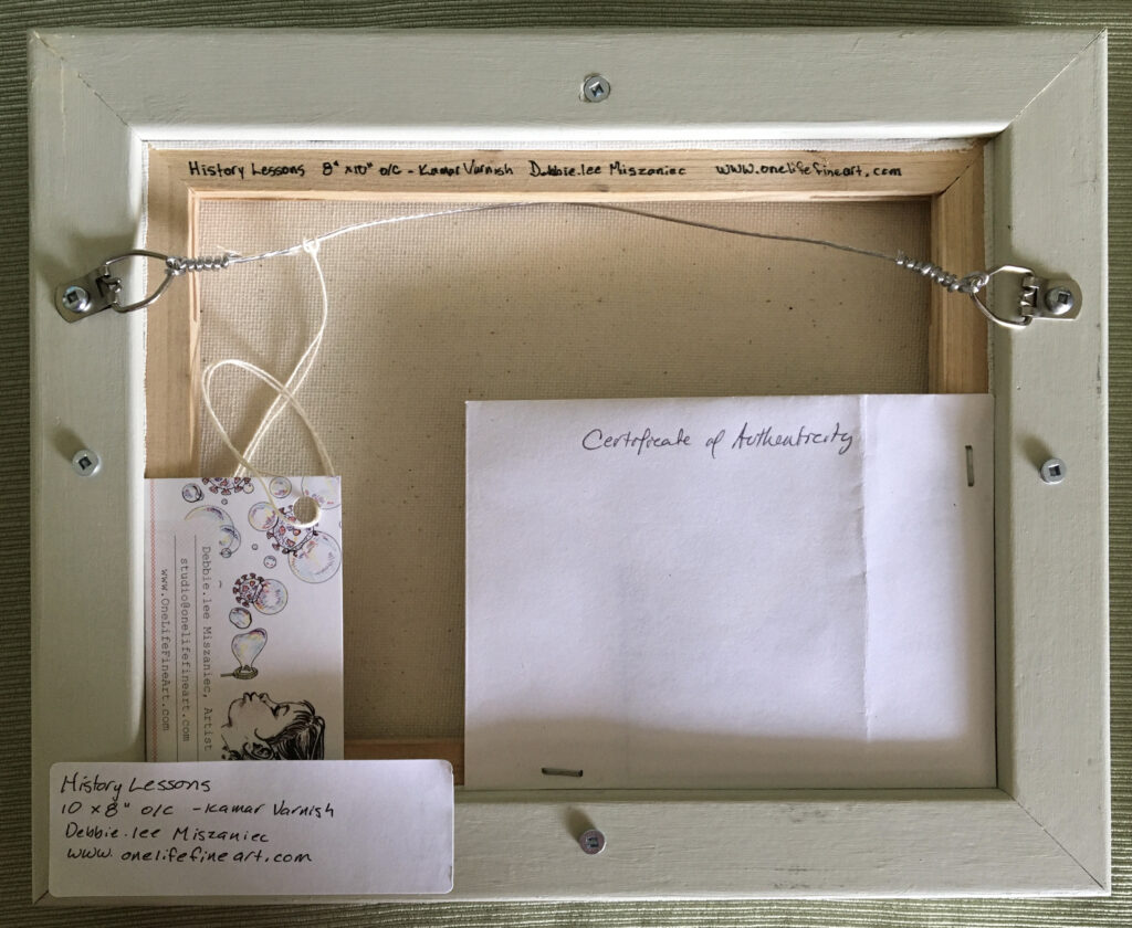
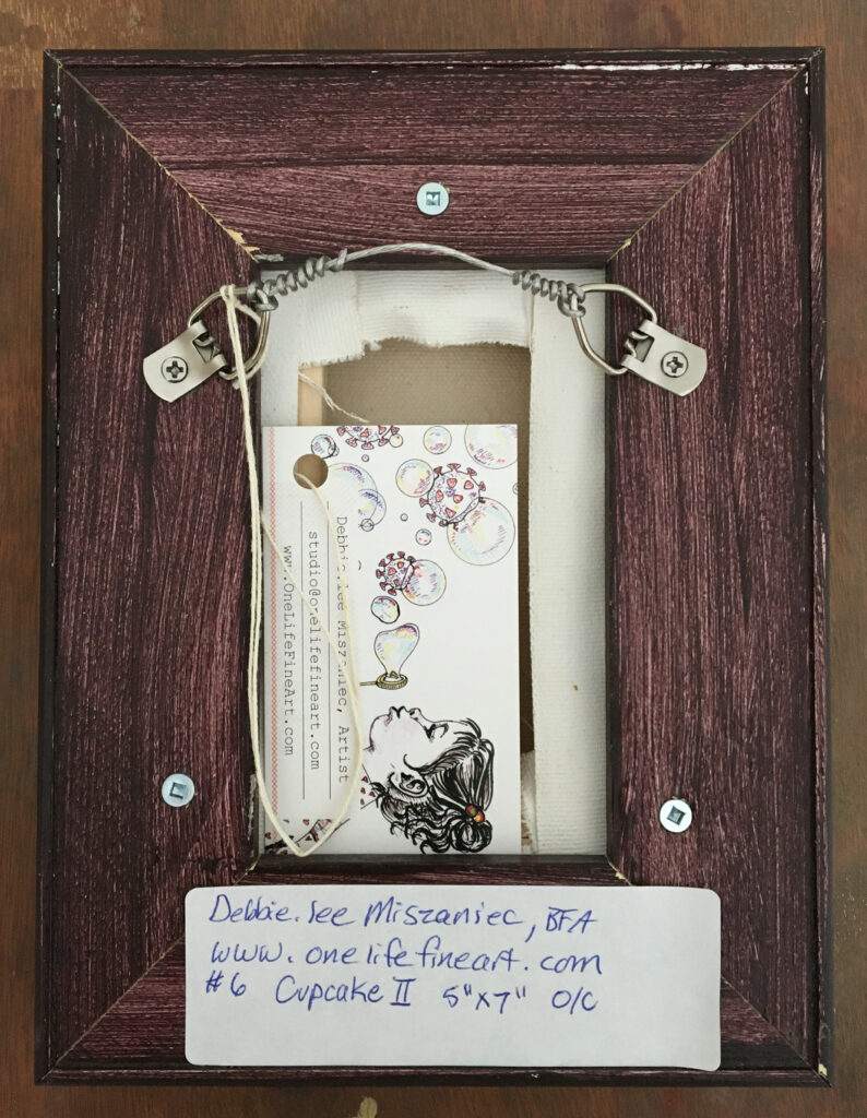
Identification and Information! Ever struggled to read an artist’s signature on the front of a painting? Having worked in galleries & frame shops, identification is a big deal. I want to know who the artist is, the title of the piece and the size (the framer in me also wants you to tell me which way is up for certain, but that is another article). As someone selling or buying the art, having the price clearly marked is handy. Finally, as the artist, clear painting identification is part of my marketing. I want the buyer to be able to see my full name & it’s correct spelling (so they can google me if it comes to that), and a way to contact me and/or see more of my work. I want them to be able to pass that information along to anyone they may know who asks about their new painting. So I include three points of identification (see the image above) and information on my paintings, beyond the signature.
On the back of every painting, usually on the stretcher bar, I print my name, website address, the title, size and medium. This way, even if reframed there is a record of the artist and art.
I repeat this information on a desktop printer label adhered to the the back of a business card attached to the wire of the frame. This is great because the card can be kept or later used to pass my contact information to a buyer’s friends.
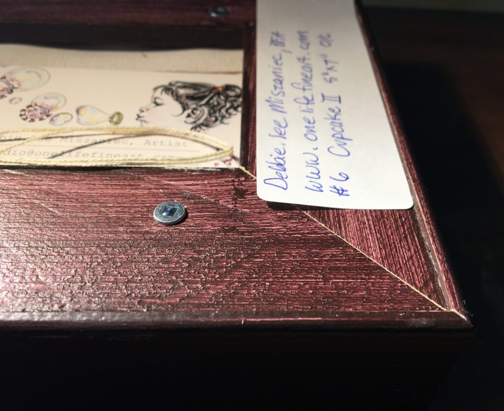
I repeat this information a third time, but with price now, on a label adhered to the frame back (or if unframed to the painting’s back). StickerCanada sent me these custom uncoated paper stickers with extra strong adhesive, and so far I LOVE them in comparison to the desktop printer labels. They are the correct size for my frames, professional looking, legible at the small size, and customizable with just a regular ball point pen (no smearing with a regular pen, but my felt pen smeared a little). My favourite thing about them though, is that they actually STICK! Desktop printer labels do not adhere reliably to canvas, stretcher bars or wood frame backs. Ideally the labels would stick for as long as the buyer owned the painting, and reasonably they should stick for the term of the show. However, frequently they begin to detach hours after being positioned, even with burnishing. It is not terribly useful if your identification and marketing ends up lying on the floor somewhere beneath your painting during a show. So, StickerCanada’s option to get extra strong adhesive on their uncoated stickers is much appreciated.
Package for shipping: This will depend on how you are shipping the works. I have never had to build wood crates for shipping, fortunately. However you really do need to think about how you are getting the art to its destination and what challenges that might involve along the way. Keep them dry, insulated from climate, and isolated from abrasion, compression or impact. When putting them in the hands of a regular shipper, I layer the art in the centre of a system of cardboard, styrofoam or foam core, bubble wrap and glassine paper. When transporting them myself (locally) I can get by with just cardboard corners and stretch wrap on the paintings. I place them back to back or front to front in an appropriately sized cardboard box. The paintings shouldn’t be jammed in tightly, but neither should they be able to shift or jostle in the box. I can then either take the packaging with me or leave it with the show organizer, although I would prefer if they utilized it for safe storage too.
Left & Centre: desktop printer label, edges lifting away from frame. Right: custom printed sticker with extra-strong adhesive. Nice!
So there you go, my experience on preparing art for a show. But, different art might need different preparation. So what are your tips?
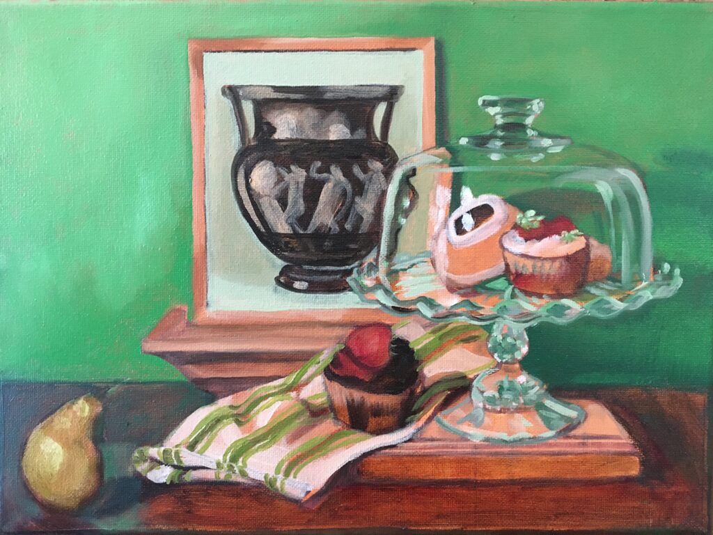
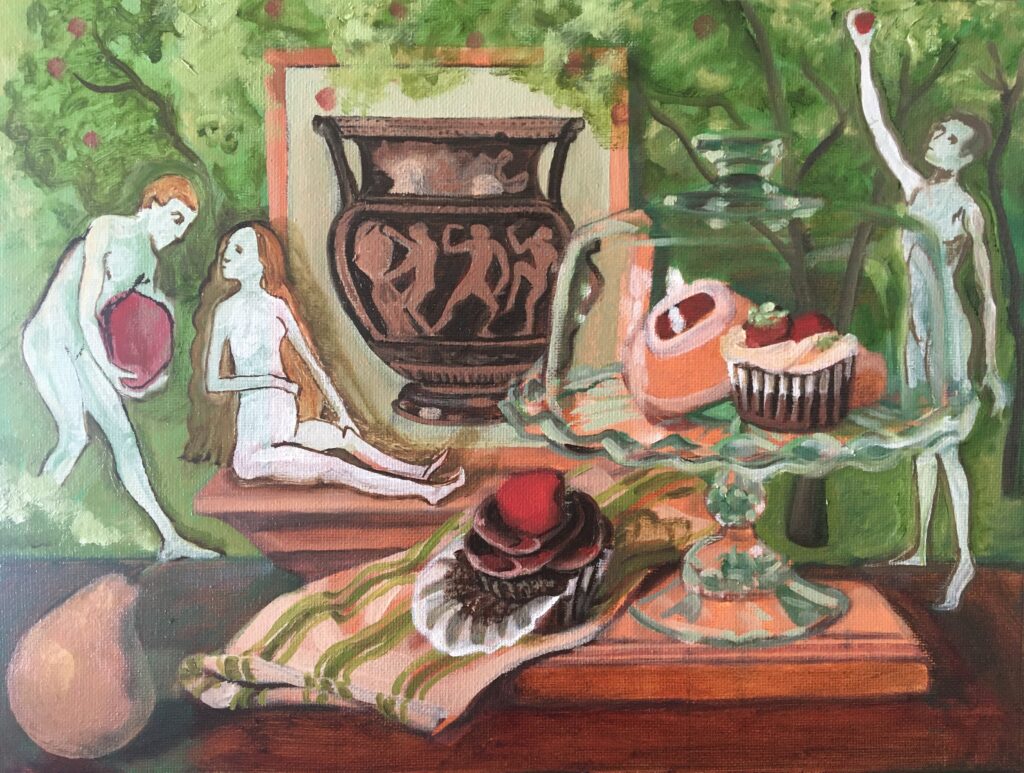
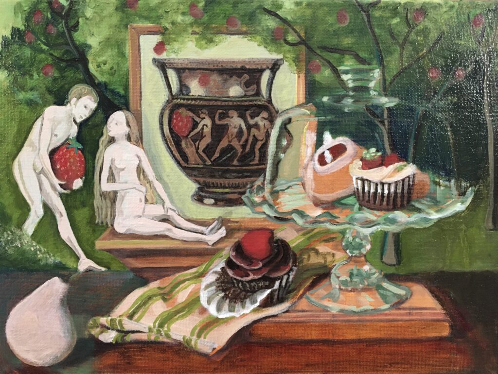
I recently finished Tempting Fruit, a fresh new oil painting in my Cravings series exploring food obsession. It features returning characters Pink Pear and the Jelly Doughnuts, as well as an art history guest appearance by a couple (or pair) from the right hand side of the central panel of Bosch’s masterpiece The Garden of Earthly Delights (c.1515) (below).
By <a href=”https://en.wikipedia.org/wiki/en:Hieronymus_Bosch” class=”extiw” title=”w:en:Hieronymus Bosch”><span title=”Dutch painter (c.1450-1516)”>Hieronymus Bosch</span></a> – <a rel=”nofollow” class=”external free” href=”http://boschproject.org/dzi/00MCPVIS.dzi”>http://boschproject.org/dzi/00MCPVIS.dzi</a> (downloaded with <a rel=”nofollow” class=”external text” href=”https://lovasoa.github.io/dezoomify-rs/”>dezoomify-rs</a>), Public Domain, Link
The inspiration for bringing Bosch into the picture began with the viridian green background in the early stages of the painting, along with the way the towel seemed to be leading the pear into the temptation of engaging with the cupcake. I really felt the desire to add a garden element to this background, and what better garden to explore in the theme of temptation than that of Bosch’s mythological garden as he sermonizes on the dangers of indulging in earthly delights. Originally I had added a third figure, but later decided to paint him out as extraneous to the main argument.
The conceptual evolution of Tempting Fruit.
One painting leads to another, so currently I am working on a new set of paintings exploring the cupcake with peeled wrapper as a character with art historical reference to another famous garden painting, Fragonard’s The Swing (1767).
Also in the planning phase are a series of ten large scale Bosch inspired still life paintings. If you know of a venue or organization that would be interested in working with me to get these made or have them shown, I’d love to hear from you.
Can’t wait for Stampede, when a hot half dozen of my treat paintings will be available to purchase in the Mini Masters Salon Art Show at the Calgary Exhibition and Stampede (see my blog post about it here) ? There are four of the Cravings paintings available to purchase now, framed and ready to hang at Arts Aqui in Calgary’s charming Marda Loop neighbourhood.
Nanaimo Bar, 6” x 8”, oil on canvas, CAN$ 350 framed History Lessons, 8” x 10”, oil on canvas, CAN$ 495 framed Butter Tart, 6” x 8”, oil on canvas, CAN$ 350 framed Containing Desire, 10” x 8”, oil on canvas, CAN$ 495 framed
Recently I have become fascinated with the paintings of 17th century Flemish still life painter Clara Peeters. Known as one of the originators of the ‘breakfast piece’ genre of still life painting, as well as the practice of including self portraits in the reflective surfaces of objects, I have become more than a little obsessed with understanding the Dutch Golden Age fascination with depictions of food and how that might connect with health and diet culture, wealth disparity, economics, the role of women, and depictions of the self. These two drawings are a way for me to find a new perspective on a familiar looking subject.
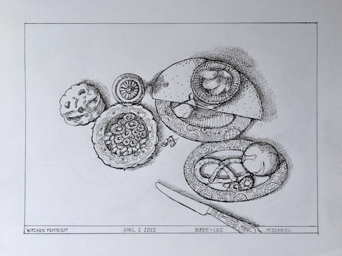
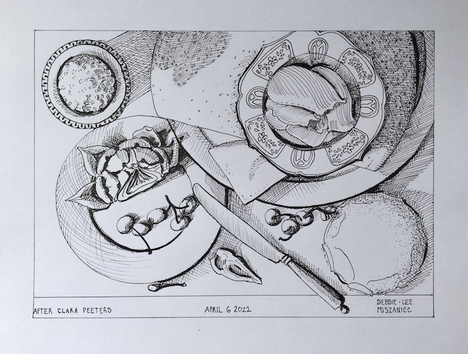
Kitchen Feminism and After Clara Peeters (Still Life with Cheeses, Artichoke & Cherries) 14” x 10.5” paper, Ink on Paper CAN$ 395 each
In Kitchen Feminism the team at the Kitchen Feminism project asked me to bring my sketchbook along so that they could film me drawing. Rather than work on something random I decided that I would like to work on something that really interested me and that potentially has connections thematically to the Kitchen Feminism project (read more about my Kitchen Feminism experience in this blog post). So I started this drawing under those highly stressful conditions, to complete later in my studio.
The second drawing, After Clara Peeters, was done specifically referencing one of her paintings, as opposed to my recollections of her work. I was able here to be much more analytical in the transfer from one perspective to another, which lead me to some interesting insights about her compositions which I think I will share in future works along this avenue. Watch for more to follow from this exploration in the months to come.
Western Showcase Mini Masters Salon Calgary Exhibition & Stampede 2022
July 8 – 17th 2022 Calgary Exhibition & Stampede – Western Oasis – Art Show 1410 Olympic Way SE Calgary AB T2G2W1
The Cravings Series will be in attendance: Lemon Bar, Cupcake, CinnamonRoll, StrawberryShortcake, MapleCookie, and Butter Tart Each 5” x 7” oil on canvas is CAN$ 250 framed.
Although the image above is of my most recently completed painting, Sisyphus Jelly Doughnuts, this is not a blog post that comes to any conclusions or announces any new events. Actually this one is just about some of the research and influences I am looking at as I journey through my current direction in the studio.
Obviously some of my research involves baking or buying delicious treats to use as still life props. Definitely a bit of a conflict of interest going on here. However for the most part, being an artist and talking about the psychological effects of long term caloric restriction through art means I am doing a lot more research into art history than into recipes.
To begin with I am looking at the often trivialized history of still life painting from the symbolic breakfast pieces of the Flemish god-mother of the genre, Clara Peeters, to the 20th century commercial culture influenced art of the Pop movement.
That covers the form and some of the content related to my interest in still life and specifically still life incorporating food, but then there is the psychological and moral aspects of health and diet culture that impact our relationship with food and our bodies. For that I am looking at Greek krater art, the Northern Renaissance art of Hieronymus Bosch , and the work of the 20th century Surrealists, for their interest in depicting the other world of the subconscious.
So that’s where I’m at now, who do you think I should be looking at for research?
It is February so by now most of us have made our New Year’s diet/health resolutions and have either made strides toward fitness or given up until the threat of swimsuit season looms.
Not yet titled. 8″ x 10″ oil on canvas. 2021. Debbie.lee Miszaniec
Amoung my resolutions, maintain a healthy weight, make more art. The first is an ongoing struggle for me, having lost nearly 38% of my body weight to reach the top end of my healthy weight range. I know I have sustained metabolic damage, because it should not be such a struggle to stay in that range. However, since we are talking about my health, rather than merely my vanity, I feel the reward to be worth the unceasing effort.
I’m a big believer in having goals that support each other, but those last two can work against each other. Art making is a very sedentary endeavour. Even though I stand while painting, which is much better for the body, I barely make 2000 steps on a studio day without taking intentional exercise.
A few ideas for getting more exercise in the studio:
Stand – you’ll move back and forth from the art more often at least
Aim for inefficiency – store things farther away so you have to walk farther to get them.
Tidy frequently – put things away between uses so you have to walk back and forth to get them again
Work ‘en plein air’ – nothing like hiking through nature with your kit over your shoulder to boost steps
Work big – climbing up and down a ladder to work on a painting incorporates a lot of movement
Take walking breaks – Studies have shown we think better when we are walking.
Make your art your health – incorporate your health journey into the work you are making.
I think this last one is possibly the hardest to do in a simultaneously earnest and yet critical fashion. The art could verge into documentation. What elevates it from that? And are you interested in focusing your creative production that way? For most artists the answer would be no, and understandably so.
The work I am moving forward with in 2022 is drawn from my own health journey. The art and my concerns, struggles and efforts toward maintaining good health are entwined. It is not something I originally intended; the realization of this emerging influence in my work came to me like a flash of light illuminating what I could not previously see happening in my art practice. I decided that if my art was being unintentionally coloured by my health journey, it would be better and more interesting to investigate that, rather than attempt to deny or purge it. Since then it has been a slow and ‘feeling my way in the dark’ type of growth, interrupted by other projects, including a global pandemic. This new direction in my work is one which questions, empathizes, and seeks insight.
However my ongoing research has given me so may connections and avenues to explore as I understand where health, evolution, body acceptance, vanity, subconscious desire, diet industry and patriarchal pressures intersect in my own personal weight loss journey, that I am excited to see where this new artistic journey takes me. I hope you will find that direction satisfying as well.
Do you love shopping local, visiting physical galleries, and seeing new art in person when you collect? Well then I have good news for you! I’ve just framed up and dropped off a couple of my Covid-19 drawings and Cravings paintings at Arts Aqui in Calgary.
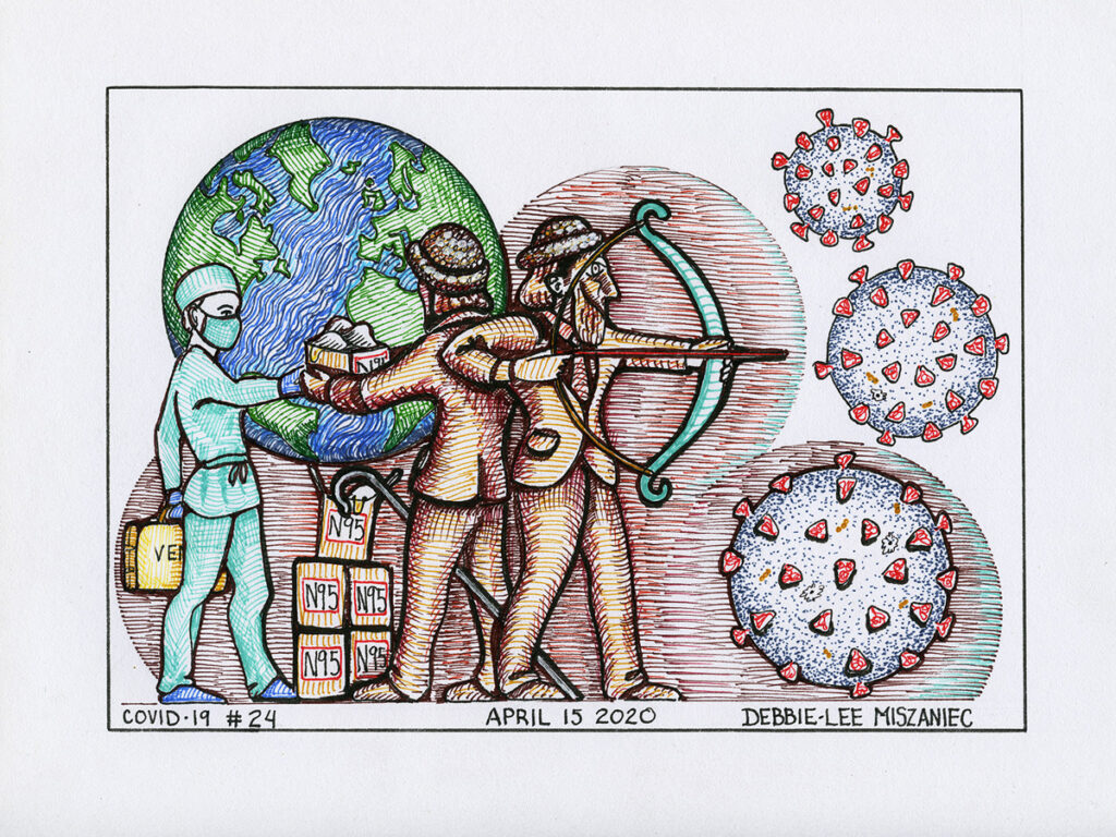
A Good Shepherd
Guardians
Buttertart
Nanaimo Bar
Let’s show our local galleries some love! Stop in, view the art in person and build your collection.
Arts Aqui hours are Tue – Sat: 11 a.m. – 5 p.m. and they are located at:


.jpg)
_in_Stedelijk_Museum_Amsterdam_Cla,_Bestanddeelnr_923-1635.jpg)
_-_WGA2503.jpg)